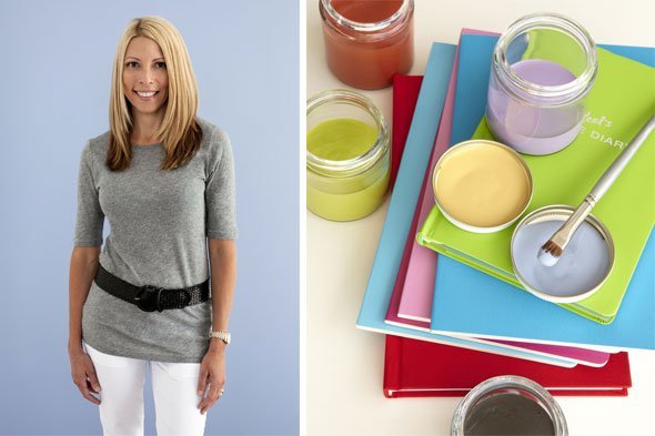
Portland-founded paint company puts those big-box brands to shame.
We have our priorities, and luxury is one of them. In the home arena, it’s not as simple as beautiful furnishings and lush fabrics — quality should come at you from every angle. So when we first learned about Devine Color, a sexy paint line started out of our sister city to the south, we had to know more.
The beauty behind the line, Portland resident and artist Gretchen Schauffler, sat down with writer Erika Solis to discuss her love of color, fool-proof ways to select the right palette and what Puerto Rico has to do with a well-rounded color scheme.
Seattleite: Why did you start Devine Color?
Gretchen Schauffler: I needed, “divine” intervention if I was going to help people eliminate color indecision and painting risks. Devine Color is a paint line with artistic color collections and paint sheens that make self-expression effortless. Each color was created and crafted around a relationship-based philosophy that makes the old, new, borrowed and true look meant to be.
S: Have you always been passionate about color and paint?
GS: More than just passionate about color, I have always been curious about why sometimes the same color can be magical and other times, plain or insignificant. Paint colors seem so unpredictable that, as an artist, I felt the need to create colors that were magical, every time.
S: You are originally from Puerto Rico then moved to the Pacific Northwest — can those two places be any more opposite on the color wheel?
GS: Different yet, oh so similar. The big difference was that, due to gray skies nine months out of the year, people in the Northwest were afraid of color on the walls. In Puerto Rico that’s unheard of. Once I realized that fear kept people from living with colors that made them happy and mentally healthier during the rainy winter months, I translated my creative views into colors they could trust.
S: What’s the purpose behind focusing on color collections instead of single paint color options?
GS: No man is an island, no color stands alone. How a color behaves depends on the company it keeps. This is why our colors are created in relationships with boundaries — not only keep good company but to be good company!
S: Clearly there are countless people out there who have no clue about color — what are your tips to help them choose hues that will work best for their homes?
GS: Think of hotels, restaurants or places and find a common thread. Most people may not know what they like, but they know what they don’t like — so think opposites. If you don’t like dark, it might mean you like light. If you don’t like red, it can mean you like yellow or green.
S: OK, so what’s with this claim that your paint, “rolls on like yogurt”?
GS: I had creative influence over the paint to have it go on like yogurt — rich and creamy smooth. It paints for you. When you paint with our paint, a steady hand, good brush and a roller, you won’t need tape. It truly stays where you put it, no splatter, dragging or sagging. It is engineered to be a smooth experience.
S: Can Devine Color work both for those who love bright colors and those that enjoy muted tones?
GS: Oh yes! We have both bright colors (such as Devine Flamingo, Pistachio Lime, Cream, Lobster, Iguana) and muted colors (like Devine Filbert, Moss, Glass) that are harmonious with other bright and muted colors, but most importantly, are harmonious with each other, making walls and furnishings seamless.
S: If you had to describe Devine Color in three words, what would they be?
GS: Intuitive, effortless and fulfilling!


