Exploring the evolution of color through the lens of twentieth century America.
Come Tuesday, April 10, Seattle Design Center is betraying their usual Thursday lecture series to accommodate the arrival of Leatrice Eiseman, co-author of Pantone: The Twentieth Century in Color and executive director of the Pantone Color Institute. While her agenda will primarily revolve around promotion for her book and Pantone, she’s bound to explore the realm of color and its influence over perception and signification, from 19th century fin de siècle to contemporary digital color.

Color Theory: American socio-personal interactions with and through color depend on what Eiseman refers to as “Our lexicon of color symbols,” or, the language of color (think stoplight party) and color theory. In design or art, color consistently acts as the vehicle for our artistic intent. Pantone tracks the metaphorical shifts in the “lexicon,” keeping designers abreast of trending colors and the near-universal signifiers of a specific tone.

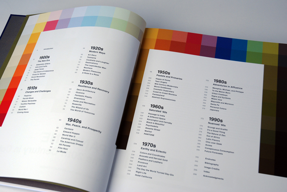
In Pantone, Eiseman (with co-writer Keith Recker) navigates through twentieth century art, design, fashion, etc. and the colors that imbued defining influence over each movement’s gestalt. Eiseman and Recker’s newest book reeks of braggadocio, but it’s well-deserved. Simply put, color is Pantone’s jam. Cognizant of their international predominance, Pantone’s influence has bled into the cultural implications of our perpetually shifting color landscape (or, more eloquently put by the co-authors: “the inherently fugitive nature of color”), endowing them with philosophic pre-eminency in color theory.
Eiseman’s lecture, entitled Color Trends from the 20th Century to 2013: Fantasies and Realities, runs from 1 – 2:30 p.m. in the plaza commons. Q-and-A to follow.
Pantone: The Twentieth Century in Color at Seattle Design Center | Tues., April 10 | 1 -2:30 p.m.
If I was blind, the color purple would be an elusive concept.
